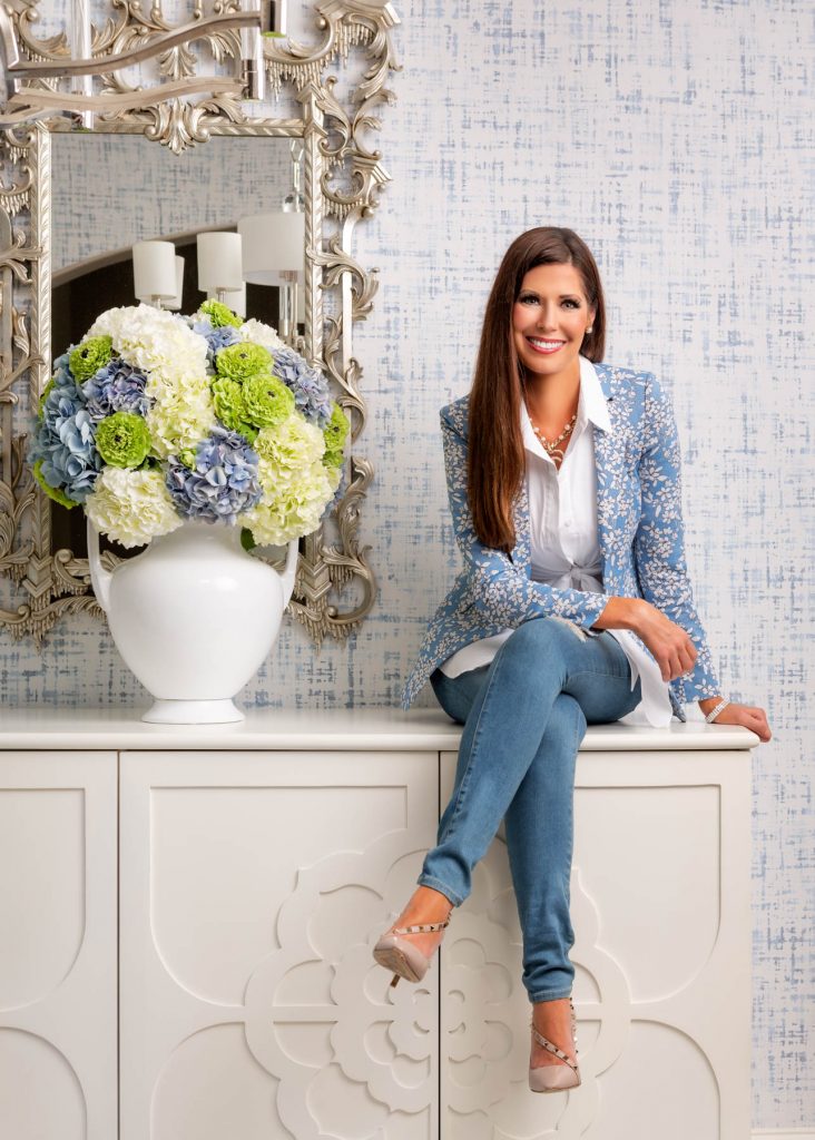
Joy. Beauty. Belonging. That’s what Shayla Copas Lifestyle is all about. A hostess at heart, I work with my clients to create homes, experiences, and products that inspire keepsake memories of a life well lived and loved. Together, we’ll sprinkle more vibrant color and soul-comforting style into your life.
A little bit Southern Glam, a little bit traditional-with-a-twist— & a whole lot of fun
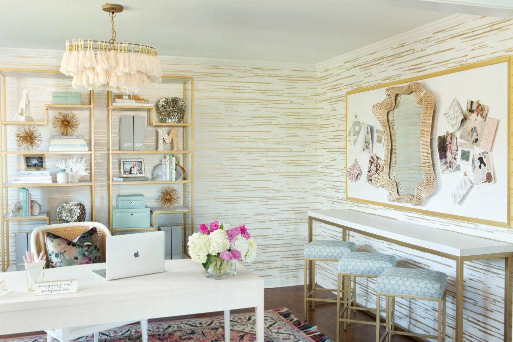
Let my team and I transform your space into your “happy place.” We mix my signature, award-winning design aesthetic with your unique vision for projects of all sizes, including residential, commercial, virtual e-design, product design, and more:
A little bit Southern Glam, a little bit traditional-with-a-twist— & a whole lot of fun
Let my team and I transform your space into your “happy place.” We mix my signature, award-winning design aesthetic with your unique vision for projects of all sizes, including residential, commercial, virtual e-design, product design, and more:
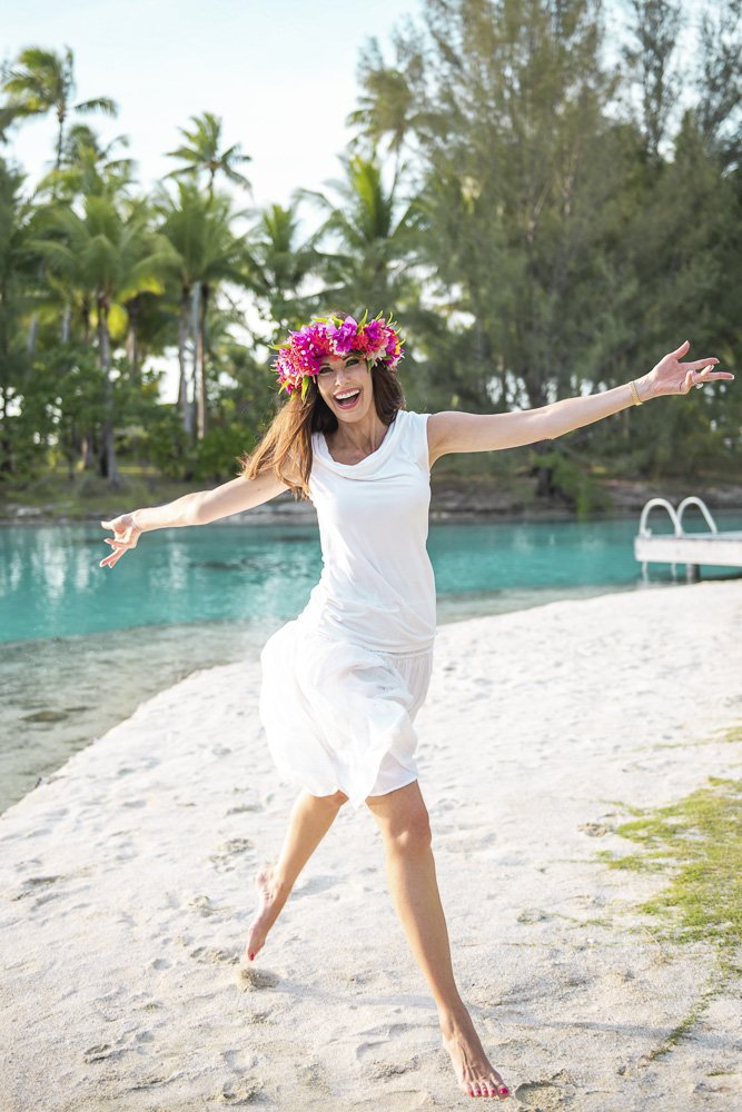
Explore the world through a designer’s eye—and discover how vivid & vivacious a place can be. I craft bespoke vacations for travelers seeking authentic cultural immersion. Or, join me on a curated small-group journey to the dazzling destinations I love:
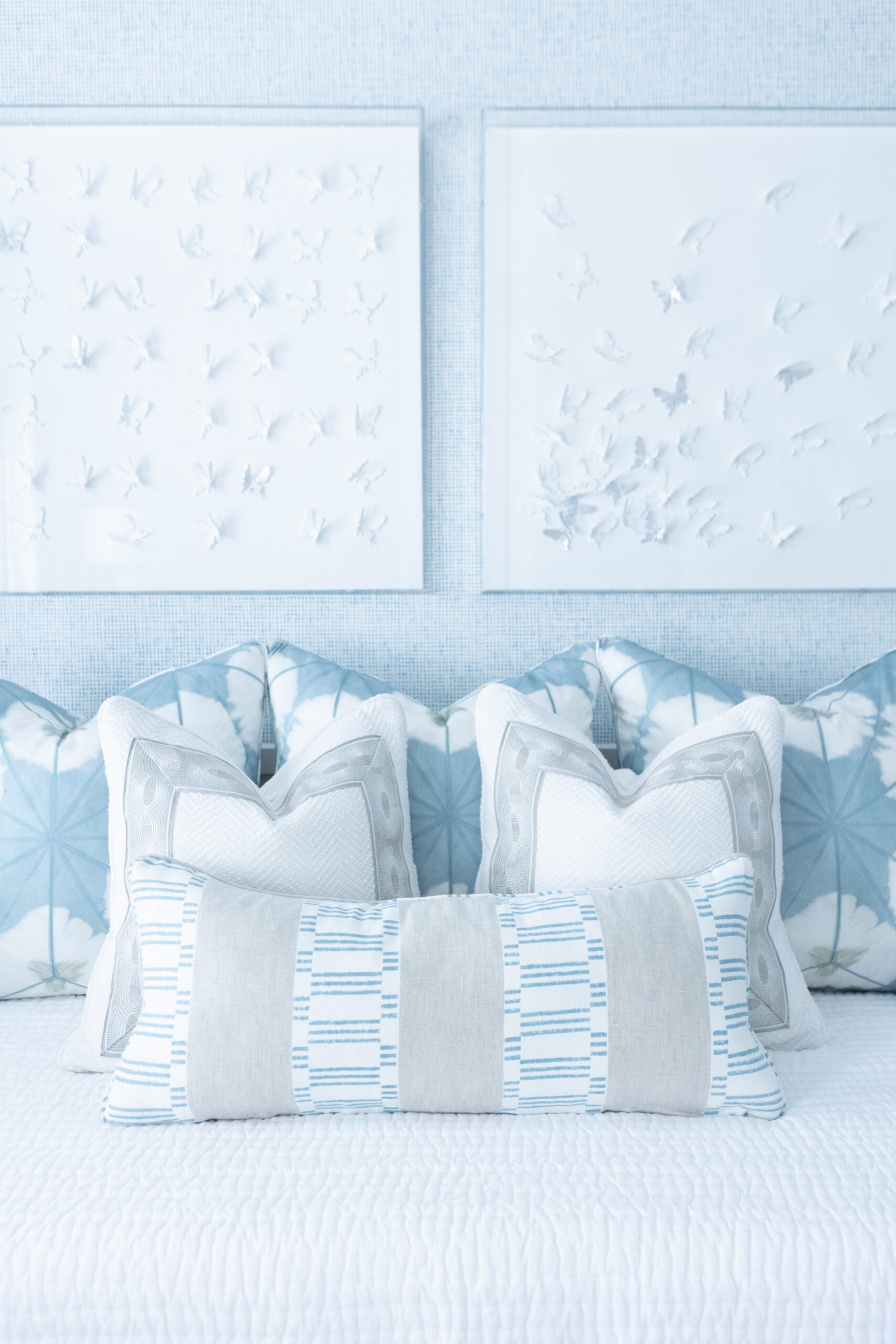
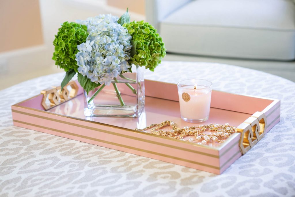
Invite more style into your life. Browse eye-catching, colorful home accessories and fresh fabrics designed by Shayla—as well as her hand-picked favorites from other fabulous creatives.
Invite more style into your life. Browse eye-catching, colorful home accessories and fresh fabrics designed by Shayla—as well as her hand-picked favorites from other fabulous creatives.
Join a tour of 16 glamourous seasonal celebrations ranging from Cinco de Mayo and the Kentucky Derby to traditional gatherings such as Thanksgiving, Christmas, and New Year’s Eve, and at venues as diverse as the Arkansas Governor’s Mansion and a show-stopping horse stable.